BEHIND THE SCENE
Iterating the Privacy Center
I'm a huge fan of iterating the same project many times rather than quickly jumping to the next one. It's my way of getting better at a skill in a relatively short time. It's like levels in a game: if you do 5 projects but never go beyond version 2, you stay at level 2. But if you push the same project to version 7, you reach level 7. The Privacy Center on my website Blankpage was the perfect sandbox to improve my skills in UX/UI design. I could experiment however I wanted and had no time limits. Over the course of a year, I took it through 7 versions. And I went deep.
Some would think I'm a "pixel pusher" or a "pixel perfect designer" after reading this (yes, I care about details), but don't worry. I like strategy, too. This page is just about the UI design details. I think it's better to figure those out in a sandbox than on a client project. For the strategic side of UX privacy, have a look at the design challenges of my projects (Privacy Center and Privacy Notice).
Below, you can see how my Privacy Center changed throughout the 7 versions. And maybe learn directly from my mistakes. Let's start!
Where it all started and where it ended
Seven versions apart. Version 1 was heavily inspired by the Swiss Privacy Icons: simple, but not very personal or detailed. Version 7 turned out quite different: empowering, interactive, and with a much better hierarchy than version 1.
Version 1

Version 7


Advancing, one version at a time
The worst version
Version 1
January 2025

This was my very first version. It was heavily inspired by the Swiss Privacy Icons. But I wanted to make it more personal by naming "who handles your data" to increase trust and provide a link directly to the Privacy Policies. I also liked the simple overview with the yellow buttons for easy access to the privacy notices of Blankpage and my hosting provider Wix.
The empowerment version
Version 2
April 2025

What's the main change?
I noted that the Swiss Privacy Icons focused more on informing rather than empowering data subjects with concrete next steps (although these are usually given in privacy notices). Since the Privacy Center was intended to be an overview of my Privacy Notice, I decided to add an empowerment section (manage cookies, know your rights, check back regularly).
What else is new?
-
Added a yellow contact button (@) because users need to be able to reach the website owner.
-
Turned Wix's privacy notice button grey to show it's not as important as Blankpage's (sorry Wix).
-
Deleted "Especially relevant: 6. Users-of-users' Personal Information" as it was too specific and just cluttered the space. I, however, kept it as a tip in my Privacy Notice.
-
Turned "Place of processing" into "Data sharing & transfer" because there wasn't much to say besides "worldwide" (it really looked strange compared to the other boxes plus I wanted to give more information).
The trend-going-wrong version
Version 3
June 2025

What's the main change?
I came across a new trend to align everything on the left instead of the center to increase readability. So I aligned the boxes and the icons on the left (it didn't work well and you'll see I undid this in the next version).
What else is new?
-
Cut section 1 into boxes to separate the parties also visually and to add hierarchy (the two most important parties with a white box and the other ones only with grey text).
-
Turned the boxes into circles (I wanted more visual variety since all boxes looked the same).
-
Moved the text below the circles to add hierarchy.
The interactive version
Version 4
July 2025
What's the main change?
FINALLY got rid of the left alignment 🎉 and added a hover effect over the boxes of section 2: The text that was underneath the circles became visible when users hovered over the boxes (see example in blue about "Processing purposes").
What else is new?
-
Made the legal text below the Privacy Center more user-centric by moving it into the Privacy Center and using a slightly easier language (I should have done this from the start... How could I be so formal? Law school.).
-
Added blue "i" icons to signal to the users that there's more information when hovering over a box.
The version that stands out
Version 5
August 2025

What's the main change?
-
Turned the background of the Privacy Center white for more contrast with the black footer. It now stands out as something "special" compared to the other elements in the footer.
-
Colored the boxes in section 3 blue to make the empowerment part stand out more.
What else is new?
-
Used a Blankpage-ish font for the title to improve the consistency of my branding.
-
Added more minimalistic and easier-to-understand icons. They're similar to icons users see daily, improving perceived familiarity with something new (my Privacy Center).
-
Made the text at the bottom even more user-centric, focusing more on value (you can get more information from privacy notices) vs. legalese (I just want to be legally safe by telling you that the privacy notices prevail).
-
Added a more casual tone to make the end more friendly and closed it with a coffee reference to my Privacy Notice (if you know, you know 😉).
The hierarchy version
Version 6
December 2025

What's the main change?
Hierarchy. Hierarchy. Hierarchy. The layout is generally the same, but the hierarchy is sharper: It's easier to spot key elements while secondary elements move in the background.
What else is new?
-
Started applying the test "How would Google or Apple design this?" by imagining my design in their interfaces. Is this really user-friendly? Looking at my last version 5, I had to say no. So I improved a few things...
-
Made all secondary elements (border of boxes, "i" buttons, blue boxes) more transparent for better hierarchy. Especially the blue boxes of section 3 were visually too dominant. Plus: Made the icons smaller and added gray circles (apparently that's how icons are designed nowadays to make them less dominant).
-
Moved the blue "i" buttons from the top right to the bottom of the boxes. Users don't know at the top of the box whether they need more information. So the button should be positioned where users have enough information to make a decision.
-
Small thing, but in the box "Purposes of processing", I reduced the text from three lines to two for visual balance with all the other boxes.
-
Added a layered approach also in section 3 using the same hover effect as in section 2 to decrease cognitive load (white box only gives an overview) while becoming more specific (hover box gives additional details). Also added a "More details" button in the hover box, linking to my Privacy Notice for easy access to more information. Look at the example "Manage cookies & similar tech".
-
Named the buttons in section 3 more specifically ("Your tools" and "Your rights") instead of just "i". This signals these buttons are more important than the general "i" buttons (it's the empowerment section after all!). Plus more concrete communication improves expectation management.
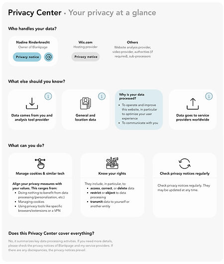
The great version (aka the "version right before the worst version is born")
Version 7
January 2026
What's the main change?
Just colored the website owner box pink (to make it stand out) and all other boxes gray. That's it. Ridiculous. But I don't see how this type of Privacy Center can be improved any further. And that's usually a sign to either move on to a different type of Privacy Center (innovators would call this "disruptive" rather than just "incremental") or start a completely new project...